Friday, April 30, 2010

number 40

our lovely mates the broadways have just given their website a redesign.
you can go see it here at number 40 and it's well worth a look, with textiles, photography, illustration and glass work all featured there, as well as links to blogs so you can keep up with what everyone there is up to.


fabrics by moira...

stained glass angel by stuart...

Wednesday, April 21, 2010

fraud


at the weekend i travelled down to london for a greenbelt visual arts planning meeting.

i went on the 'megabus' which was an experience - a bit like going back 25 years to the days when it felt like a real luxury to find a vehicle with any sort of toilet on it.
i guess you get what you pay for.

anyway, as sue pointed out, it's technically a coach, not a bus, so i didn't do any drawing.
[i know, i know. i feel like a fraud. i'm not proud of myself...]

here's the print of my journey back from the train station at the end of the [very long] day.
it's a bloke sat on a wall in harehills as viewed from the bus as we passed.
[for any pedants reading, it was a 13 bus - i forgot to include that on the print]

Friday, April 16, 2010

30 & 31...


this one sort of follows on from the bloke stood in front of the exit on the bendy bus [bus trip 28]
she had really great scarlet hair...


and this one is similar. i got quite interested in getting the stance right - with the movement of the bus folk stand kind of oddly, balancing themselves against the roll of the vehicle... not sure i've quite captured it here, but they sort of work.

i'm not drawing the backs of folk for a while though - i've done enough of those sort of poses for the time being i reckon :-)

Thursday, April 15, 2010

bus interior...


here's my print of the journey out into town on tuesday nite.

i'm really happy with this one - my first stab at three-colour printing.

the blue doesn't quite zing like i'd hoped, and pedants will probably like to point out that those handle things top left should be yellow.
and the star in the text should be grey and the date black.
but overall, it's worked better than i'd hoped it might, and i really enjoyed doing it.

result!

Wednesday, April 14, 2010

tv debate...

feeling very cynical about the leaders debate on tv tonite.
from 'television, drug of the nation' by the disposable heroes of hiphoprisy...

...T.V. is
the stomping ground for political candidates...
T.V. is mechanized politic's
remote control over the masses...
It's the perpetuation of the two party system
where image takes precedence over wisdom
Where sound bite politics are served to
the fastfood culture
Where straight teeth in your mouth
are more important than the words
that come out of it...

i think cameron will probably come out of it best.
not because he's got anything valuable or important or even particularly intelligent to say, but almost precisely the opposite - because he's a PR man, and he'll be more slick than the other two.
it's hugely frustrating that for years blair was pilloried for being more style than substance, and yet now there's a real chance that we could end up with someone like cameron in charge...

short clip from the gb photoflashswap last year...

exit


another bendy bus print.
this was from my outward journey earlier in the day...

i ended up sat facing the exit door which seemed like a bad move for a minute or two, but then this guy came and stood across the doorway right in front of me, and all was well.

i tried to get the architecture of the bus in a bit, and that makes for some nice abstract-y shapes.

there's a religious analogy going on in here as well, maybe.
also in the previously blogged one [which, confusingly, was from the later bus trip]...

i like the way that they work as a pair.

[i'm very fond of these couple]

bendy bus trip...


i'm out of sequence with these again...

last nite i was out and about - four bus trips in total [into town, then out to armley, then back again]

travelled on the no4 purple bendy bus for the first time [unless you count a two-min hop-on-hop-off a stop later journey a year or two back]

clearly, the bendy buses were designed by sci-fi fans. right down to the futuristic fonts they've chosen for the signage. the whole furniture of the things scream 'Battlestar Galactica!'.
i kind of like it.

no offence to armley, but it does seem slightly incongruous to be travelling out into south leeds on a vehicle quite that swish and self-consciously cool...

anyway. i think some of the futuristicness is reflected in this one - mainly the lettering.
on the bendy bus, the seats face in different directions, meaning that you can draw peoples faces and not just the backs of their heads. the downside of this is that they can see you drawing them. so you have to be either very brazen [which i'm no good at] or very surreptitious [which i'm also not very good at, but at least it's less potentially confrontational]
this girl on the bus clocked me straight away though, before i'd even decided to draw her.

i like the composition of this pic though. she really was half-glaring at me through the hand rail like that.
somehow the design of it remind me a bit of rennie mackintosh - the shapes and the parallel [ish] verticals on the right [the folds of the bendy joint bit in the middle of the bus]

Monday, April 12, 2010

no 97 bus


a bloke i drew from the no 97, headingley to the city centre.

i'm getting the hang of this two colour printing now. or improving, at least
:-)

i'm abandoning the requirement to put all the text on there - the journey times and stuff...
from here on i'll only stick that on there when it suits the design.

Sunday, April 11, 2010

wordy bus trip


so with this one and the previous print i'd got a bit frustrated with the need to draw every trip.
hence all the writing.

this one was a kind of 100+ word stream of consciousness prose poem thing, but i had to edit it right down to fit on the block.

i'm still learning how to best mix the acrylic/block print medium stuff, and how it works when you apply it [best i think if you can leave it to go a bit tacky before you apply it]
and bits of this don't work too well ["SNAKO" for example]
some of the lines are cut too thin [particularly with the home-mixed ink]
so it's not a particularly artistically appealing piece.

but the black lettering on the blue works a treat, and i also love the bits that don't quite register and you get an accidental drop shadow.

after you've printed the blue colour you re-cut the block for the black and there's a sort of glorious, destructive pleasure when you hack away the blue lettering [eg "Bag in a tree", "Past the fire station"] that you'd so painstakingly carved just a day before :-)

Friday, April 9, 2010

"seething tension..."


this one's kind of self-explanatory.
it made sue laugh, which is good, as i like her laugh [imagine a sort of cross between a chuckle and a smirk. a chirk? a smuckle? anyway...]

it was cut without warming the lino [this was quite a pliable block] using just one tool, and not worrying about being too precise.
that said, the lettering was pretty tricky to do.

number 24 was going to have about twice as much lettering on it as this.
i'm having a rethink about that one now :-)

Thursday, April 8, 2010

bus trip 26


i've got a bit out of sequence here - trips 23-25 are still either partially cut or not even drawn onto the blocks at present.

this is my first stab at two-colour printing.
the guy pictured was stood outside the building college, bright red hair and a matching orange coat/jacket.
i'd been thinking for a while about trying to use an additional colour, so this was ideal.

using a medium to convert the acrylic colour for the orange layer into ink was not quite as straightforward as i'd hoped [i'm terrible at judging quantities and ratios...!] but i got it about right in the end...

the letters at the top work well, i think [the numbers, less so]
i like the way it doesn't quite register, so you get an orange echo of the black outline.

next time i do a two-colour print i'll try to use the second colour to create highlights and shadows - he's maybe a bit flat here.

that said, i'm still quite chuffed with this.

hannah's etsy store...


our friend lovely hannah b has just opened up an etsy store where she's selling her quirky prints of everyday stuff.

we have a couple hanging up round the place here, they're great and oft-commented upon.

they're also extremely reasonably priced, so it's well worth a browse...

:-)

Wednesday, April 7, 2010

printing process...


the bus print project is ongoing. it's got a bit stalled up of late. i've four trips awaiting my attention right now - they've been on the backburner while i've worked on other, paying jobs and then been away over easter [more about that later, maybe]

the thinking behind the project was to learn a new skill, and to make sure that i'm drawing stuff regularly, and not just illustrating [if that makes sense!]

so the stuff i'm producing reflects that i guess - it's not all great, and in the finished prints you can clearly see some of the struggles with the process that i'm having [eg finding the best paper to use, working out how to ink up the lino so that you get nice flat areas and no splotchiness* at the edges, cutting outlines with a knife vs cutting them with a lino tool... etc etc]
i'm hoping that the imperfections are part of their charm :-)

anyhow, above is a photo of the desk i'm printing at.
amongst the general clutter of bits of tissue, pencils, brushes, masking tape and paint are all the things i'm using to make the prints...
1. coffee [very important]
2. hot water bottle [for warming lino up during the cutting bit of the process]
3. a thing i cobbled together to enable me to line up the lino on the current print [my first stab at two-colour printing]
4. the cut lino block
5 & 6. lino cutter and tools [cheap ones, but they work ok]
7. roller for pressing the paper onto the inked-up lino
8. spoon, also for rubbing the paper onto the block
9. roller for applying the ink to the block
10. stuff that converts acrylic paint into printing ink. not quite got the hang of it yet :-)
11. acrylic paint
12. black printing ink [water based]
13. ink made from acrylic paints and (10.) on a tile for rolling up [but i made waaay too much]
14. ink rolled ready for the block

an important bit of kit that you can't see here is the cd player. i've discovered that the best music to print to is the fall and bloc party. turned up quite loud.
[sparklehorse and mark hollis and brian eno's music for airports were all fairly disastrous choices - too soothing and relaxing...]

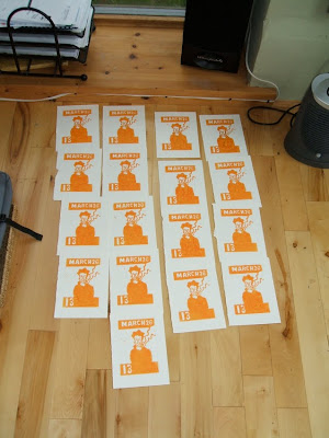
and here are the prints layers drying in readiness for a second print [the black layer, once i've cut away a bit more of the block]
i've done more than the usual thirteen of this one, because i'm pretty sure i'll mess a few up adding the black layer, and once i've re-cut the block to do that, there's no going back...


*it's a technical term... :-)

wish i'd been there...

...at the 6music broadcasting house protest.

if you haven't already please go sign the online petition, fill in the bbc consultation survey thingy, and email the bbc trust to register your displeasure at the decision to axe the best music station that the corporation has. [which will be done in the name of improving quality, apparently. i know, makes no sense to me either]

even if you don't listen to the station yourself, helping to save it will be better in the long run as it will drastically reduce the level of curmnudgeonly whingeing on this blog, for starters :-)

and imagine a world without gideon coe and marc riley's shows. doesn't bear thinking about does it?

Thursday, April 1, 2010

more bus action...


more bus stuff.

this one's been done a while [as you can see from the date]

it's four trips into and out of town to meet with gav and do some shopping...

each trip on the print takes up an amount space equivalent in ratio to the time spent on each bus [if that makes sense?]

to be honest, i was a bit uninspired. and i finished a sketchbook and had to buy a crappy notebook in order to have something to draw the journey home on.

see if you can spot where i completely omitted a number.

i really like the roughness of the black letters on this. and the bloke with the glasses next to the pickard sign.
and the guy with the tartan hat too.

shame that the composition's a bit all over the shop :-(


meantime, i now have four more prints queued up and awaiting my attention. not even drawn them up onto the lino yet. :-(

"it's not quite 'where's wally'..."

why not go have a laugh at my floundering attempts to explain meself on the latest cpas podcast...

wild billy childish

last year at greenbelt we had billy childish being interviewed in the hub tent, and he was great, talking a lot of sense and saying some very thought-provoking stuff about life and art...

last week there was a short documentary about him on radio 4, and i meant to post the iplayer link, but didn't quite get around to it, and of course now it's too late.

but here are a few selected quotes from the programme that i really liked...

on the subject of people saying he can't draw - "picasso didn't get told off for bad drawing - he just made a decision..."

on being asked about his career as an artist - " 'career' is loathesome..."

on his various bands attempts to try to get rid of their fan-base every time it sprang up - "the more the audience owns you, the less you own yourself" [made me think about a conversation i had recently about how christ spent so much of his ministry actively trying to escape the crowds following him, and also of various scenes in 'life of brian'...]

the programme ended with him saying, "i want to mature, to be a better person, to be closer to god, and you can't do that by winning."

amen to that.

read all about it, read all about it...

news of the world, news of the world...*


[* or the church times, to be more precise]